
As part of the UX/UI Special Interest Group at the McGill Centre for Integrative Neuroscience, I was tasked with optimizing and modernizing the look and usability of LORIS, a research and project management software. By applying UX and design principles and establishing design standards, we sought out to improve its interface.
THE PROBLEM
One of our focuses was to optimize the data entry user’s journey. A data entry personnel’s problem is that she needs to easily and quickly complete her data entry task so that she can attend to other tasks in her busy schedule. How can we ensure that she can easily find and complete the forms accurately so that she can be productive with her time?
Our main desire was to lessen the user’s cognitive load. From user feedback, we learned that LORIS’ primary colour, LORIS blue, was applied too heavily across the interface, making it overwhelming. It was also noted that whitespace and contrast were underused, particularly in the navigation bar. The lack of colour variation and text hierarchy made navigating less intuitive.
Furthermore, we heard from users that their workflow of directly entering data from paper to screen was made more difficult by the misalignment of the digital forms and its mismatch with its paper version.
THE SOLUTION
Role
UI designer, developer in team of 6
Scope
Created chosen colour style, proposed use of icon toolkit, issued all code changes
Tools
Sketch, Adobe Color, CSS, Font Awesome, Bootstrap
To solve these problems, we focused on 3 areas: colour system, alignment, and iconography.
Colour system
We created a text hierarchy by defining a colour system and applied it to the navigation bar to make navigational elements and their states easier to identify.
Basing our decisions on the user feedback, we wanted to implement colours that would lighten the user’s cognitive load and take advantage of the Aesthetic-Usability Effect. We created a colour system in order to maintain a consistent and clear visual hierarchy and style.
We decided to preserve the LORIS blue as it effectively represents and serves the field of the product. However, we knew that we could only sparingly use it due to how dark it was. Therefore, we defined a system that would include variants for the primary colour and a secondary colour that would be complementary to the first.
We came up with various colour styles that were created with the software’s use case in mind. We pulled out palettes from contextual imagery such as brain scans, and considered colour psychology in our choices. To select our final colour style, we conducted testing on users and chose the style that received the most positive reviews. The colour style that I had created was in the end the one selected.
In testing the styles, I learned to think critically about colour application in visual hierarchy. I created a focused colour style and applied it as follows:
- Primary colour: LORIS blue for navigation bar and branding
- Primary colour variant: Darker Blue variant for primary buttons
- Secondary colour: Orange for links in hover states
I sent a prototype and created a pull request with this new colour system for further feedback, and refined and iterated before it was merged into the codebase.
Alignment
Before our cleanup, the digital forms that were rendered by templates had varied indentation which made it hard to read. Users reported that it was frustrating to constantly realign their eyes while completing the questionnaires.
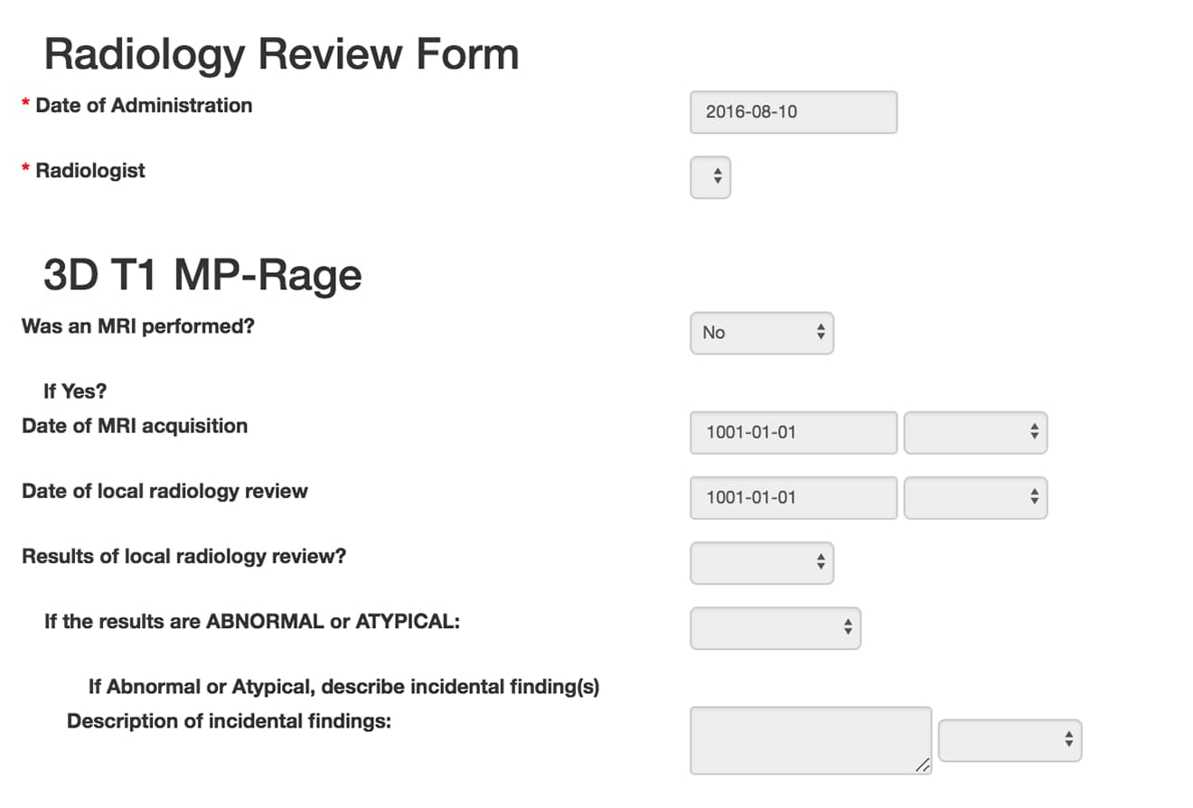
We correctly aligned the forms and rendered them as their paper version to help decrease cognitive load when completing the task.

Iconography
Because LORIS had been first developed in the 90s, a lot of the graphics used were from that time and had not yet been updated. While the icons had not produced pain points for users at the time, as soon as we applied the new colour style, it was clear that they needed to be replaced.
We updated the iconography for a cleaner, and more modern and consistent look. We replaced the outdated icons with FontAwesome’s library, which was easy to manage and also improved performance by allowing us to remove all individual icons from the application’s assets.
While merely updating the icons improved the look of the panel by improving clarity, doing so in tandem with the new colour style greatly increased contrast and readability.
The results
Applying the colour system greatly improved the interface, the results of which were apparent right away in the user’s journey: on the login and dashboard pages.


The changes were not very extensive in scope and only targeted specific elements in the UI. Nonetheless, the feedback we received from users after applying the changes on production were overwhelmingly positive.
Users reported being able to see groups of information more clearly, identify links and other navigational elements such as primary buttons more easily, and generally felt less overwhelmed when using the interface.
A data entry personnel reported enjoying completing her task way more than before, as entering data from paper into the screen was made much easier due to proper alignment of the forms. Another end-user also mentioned that the updated icons were more desirable to interact with when conducting quality control of the data using the QC panel.
NEXT STEPS
During this process, we were able to clean up the CSS along the way. This resulted in us also receiving positive feedback from developers who appreciated being able to follow a design standard and having a clearer CSS layer specificity.
Going forward, we decided to continue with the CSS cleanup, now that a design standard was in place. To minimize the number of CSS files required, we opted to move away from utilizing Bootstrap now that Grid and Flexbox were part of the CSS specifications. It was indeed for the purpose of layout for forms that Bootstrap was first implemented.
Removing the Bootstrap dependency and CSS layer will further simplify future development and help establish a consistent visual style.